fu: Close-up of Fu, bringing a scoop of water to her mouth (Default)
fu ([personal profile] fu) wrote in [site community profile] dw_beta2012-09-23 11:54 am

Comment Pages in S2: the old becomes new

One of our long-running projects is to remove the old crufty code written in BML (our old templating system) and replace it with better alternatives throughout the site. And the coding for talkread.bml -- which is what is used any time you load up a site-skinned comment page -- is a particularly painful example.

Add to that, having the site-skinned comment pages be written one way, and custom comment pages another, makes it likely for one to lag behind the other. For example: site-skinned comment pages show the link for entries with screened comments as: "x visible | y screened". But S2 comment pages didn't have that information until this code push!

So I'm really happy to say that we have a new version of the comments page which uses pure S2, so now site-skinned comment pages and journal-styled comment pages are formed the same way on the backend even if they don't look the same. [personal profile] exor674 worked hard on the backend to make this possible, then [personal profile] momijizukamori came through with some spit and polish (with some help from [personal profile] kunzite).

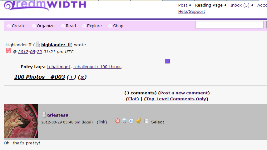
The idea is for the new version to look as much as possible like the old version, though there might be a few discrepancies, because the backend is so different. [personal profile] momijizukamori has done her best to mimic the look and feel of the old comment pages. But the comments page is one of the most used pages here, so we'd like you all to come and give it a good shakedown.

Turn on beta testing for the "New S2 Comment Pages" -- and let us know in comments if you find anything out of the ordinary.

List of known issues.

momijizukamori: Green icon with white text - 'I do believe in phosphorylation! I do!' with a string of DNA basepairs on the bottom (Default)

KNOWN/FIXED ISSUES

[personal profile] momijizukamori 2012-09-23 04:41 am (UTC)(link)
Collecting these here for everyone's edification :) Please reply to the main post with issues, not to this comment. Otherwise I can't edit and keep it updated!

Known


  • Comment subject has too much padding in Lynx/style=light
  • Filter/restriction symbols printing in a less-visible location
  • Time not displaying in 24-hour UTC format
  • QR box is appearing centered on page instead of under the comment it's in reply to
  • Very deeply nested threads may not be printing as links properly (core2 issue)
  • JS beta icon browser is taking the Tropo colors instead of the selected site scheme colors


Fixed


  • Comment header color is working off post order, not depth
  • Small gap below icons in comment headers - thanks [personal profile] chagrined for the fix!
  • There is no space between comment body and edit time, when a comment is edited - workaround, may need to be fixed in core2
  • Celerity is adding a border to .entry .header
  • Collapsed comments have a bolded subject link
  • Comment subjects are now links
  • ?style=light strips page styling along with all other styling
  • Entry title is now h3 instead of h2
  • div nesting within threads doesn't play nicely with CSS precedence
  • Seperator before 'Expand All' appears inside parentheses
Edited 2012-11-14 02:48 (UTC)
ahappylie: (Thinking)

comment title link feedback

[personal profile] ahappylie 2012-09-23 04:43 am (UTC)(link)
Just a visual tic of mine, but having three ways to link to a single comment seems a bit redundant to me. The comment title turning into a link changes the visuals of the site in a detrimental way to me, what with the extra underline on the title doubling up against the journal name and its underline and the overabundance of red in the header. Leaving the header as is with a black non-linkable title and the (Link) seems fine to me.

I've heard this is an issue with the S2 system that the developers weren't sure if they wanted to keep in, so I understand the reasoning, but that's my two cents on it so far.
musyc: Silver flute resting diagonally across sheet music (Default)

Re: comment title link feedback

[personal profile] musyc 2012-09-23 04:57 am (UTC)(link)
Seconding this. Leaving the subject headers as they were is preferable. Making them clickable links is very distracting in site scheme (Tropo Purple, here).
chagrined: Marvel comics: zombie!Spider-Man, holding playing cards, saying "Brains?" (brains?)

Re: comment title link feedback

[personal profile] chagrined 2012-09-23 05:02 am (UTC)(link)
I also really dislike the anchor-text-colored and underlined subjects on comments. I don't mind the fact that they link to the comment? But wish they'd lose the underline and revert to the regular non-link-text color. (For example, a lot of DW journal styles do that same thing for entry subjects. They are links to the entry, but they don't have the underline and they're the same color as the regular text, not the links.) (eta: this is when viewing with ?style=site, and I'm using tropo red)
Edited 2012-09-23 05:03 (UTC)
momijizukamori: Grey tabby cat with paws on keyboard and mouse. The text reads 'code cat is on the job', lolcats-style (CODE CAT)

[personal profile] momijizukamori 2012-09-23 05:04 am (UTC)(link)
Oh, that's a method I hadn't thought of! Though it's generally not great practice to have a link indistinguishable from text...

But I'll definitely keep it on the table *g*
chagrined: Marvel comics: zombie!Spider-Man, holding playing cards, saying "Brains?" (brains?)

[personal profile] chagrined 2012-09-23 05:12 am (UTC)(link)
DW does already do it all over the site in a lot of their journal styles, though? But if you mean like, in the case of it being the site style, I see the point. (If it's changed to the new way, for myself I'd prolly just write a stylish script to make them look how I want and all.)

(Some other things I noticed I'm gonna put in a new comment now, heh.)
momijizukamori: (dreamsheep | styles)

[personal profile] momijizukamori 2012-09-23 05:14 am (UTC)(link)
A lot of them distinguish on hover (ie, change color or the underline appears), though yeah, a few don't. And yeah, not so great to have it on site scheme - but as I said, it's definitely an option for us to consider :)
chagrined: Marvel comics: zombie!Spider-Man, holding playing cards, saying "Brains?" (brains?)

Some other differences I noticed in the site comment scheme

[personal profile] chagrined 2012-09-23 05:18 am (UTC)(link)
I made a picture of this for reference but it's large so I'm linking rather than embedding: http://i49.tinypic.com/2e49fv6.jpg

1) There is a small gap under the userpic btwn it and the bottom edge of the div it's contained within. Prolly a margin or padding that needs fixing.

2) The color-meaning scheme in relation to comment hierarchy has changed. Old style has top level comment subjectbars (whatever they're called) one color, and then next-level comments are another color, and I believe comment color swaps off like that based on the level of hierarchy. In the S2 style, color instead swaps off with each comment, regardless of hierarchy level. This makes the hierarchy levels more difficult to distinguish.

3) Old-style there is a gap btwn the bottom of the comment text and the "last edited" notice, if the comment was edited. New style there is not a gap. Prolly again an easy fix with margin/padding or w/e.

I'll comment if I notice anything else. :)
momijizukamori: Green icon with white text - 'I do believe in phosphorylation! I do!' with a string of DNA basepairs on the bottom (Default)

Re: Some other differences I noticed in the site comment scheme

[personal profile] momijizukamori 2012-09-23 05:26 am (UTC)(link)
1) It's not actually padding or margin - I have yet to figure out /what/ it is, or how to fix it other than making the comment header fixed-height (really really really bad if an image doesn't load and prints it's alt text instead)

2) I literally noticed that when I edited that comment. EMBARASSING.

3) Ooh, nice catch! And now that I look, fairly easy to fix :) I guess the BML page was calculating the .odd or .even class off of depth, while S2 .comment-wrapper does it off of print order. But! We have an option for doing it by depth, too.
highlander_ii: Chris Pine kneeling on the floor holding a camera to his face ([Hugh] 001)

[personal profile] highlander_ii 2012-09-23 05:27 am (UTC)(link)
in beta:

post is this: http://highlander-ii.dreamwidth.org/554588.html

click the comment link, you get this: http://highlander-ii.dreamwidth.org/554588.html?nc=3#comments

-- the 'action' icons across the top are missing
-- the post 'content' is hidden (this may be desired behavior, but not one that I've seen in the past
momijizukamori: Green icon with white text - 'I do believe in phosphorylation! I do!' with a string of DNA basepairs on the bottom (Default)

[personal profile] momijizukamori 2012-09-23 05:31 am (UTC)(link)
Hmm, can you screencap for me? I'm still seeing the post and interaction links if I scroll back up from where the '# comment' redirects you.
momijizukamori: Green icon with white text - 'I do believe in phosphorylation! I do!' with a string of DNA basepairs on the bottom (Default)

[personal profile] momijizukamori 2012-09-23 05:45 am (UTC)(link)
Hmmmm. Are you using any Greasemonkey scripts? That's... really weird.
highlander_ii: Tony giving peace sign w/ text *peace* ([MCU] 001)

[personal profile] highlander_ii 2012-09-23 05:46 am (UTC)(link)
just the DW post expand/collapse one... which could be doing it, as, both of those posts had been collapsed.

... and the expand/collapse icons are on that page and they work... so, that's probably it.... (just tested that)
Edited 2012-09-23 05:47 (UTC)
chagrined: Marvel comics: zombie!Spider-Man, holding playing cards, saying "Brains?" (brains?)

Re: Some other differences I noticed in the site comment scheme

[personal profile] chagrined 2012-09-23 05:47 am (UTC)(link)
Figured out the gap. The img element for the userpic needs to be set to display:block;
momijizukamori: Green icon with white text - 'I do believe in phosphorylation! I do!' with a string of DNA basepairs on the bottom (Default)

[personal profile] momijizukamori 2012-09-23 05:48 am (UTC)(link)
Hm. Can you turn it off and test or look in another browser?
momijizukamori: Green icon with white text - 'I do believe in phosphorylation! I do!' with a string of DNA basepairs on the bottom (Default)

[personal profile] momijizukamori 2012-09-23 05:49 am (UTC)(link)
Aha! Okay :) Yeah, the Greasemonkey script must be looking for something in the CSS, and refreshes on page-load
highlander_ii: Josh Duhamel's hip; his hand in his pocket ([Josh D] hand inna pocket)

[personal profile] highlander_ii 2012-09-23 05:50 am (UTC)(link)
probably so... Chrome didn't do that (doesn't have that extension)...

momijizukamori: Green icon with white text - 'I do believe in phosphorylation! I do!' with a string of DNA basepairs on the bottom (Default)

[personal profile] momijizukamori 2012-09-23 05:56 am (UTC)(link)
Okay, sounds like a Greasemonkey problem then, unfortunately :\ Might be worth reporting to the script author?
momijizukamori: An extremely excited super-deformed Dante from Devil May Cry 3. The text reads 'Booya!' (Dante | booya!)

Re: Some other differences I noticed in the site comment scheme

[personal profile] momijizukamori 2012-09-23 06:03 am (UTC)(link)
/makes a note of this

Thank you!
marahmarie: (M In M Forever) (Default)

[personal profile] marahmarie 2012-09-23 06:10 am (UTC)(link)
Titles aren't linkifying for me in site scheme with comment beta turned on. They're supposed to, right? (using tropo red, btw)
Edited (info) 2012-09-23 06:11 (UTC)
momijizukamori: Green icon with white text - 'I do believe in phosphorylation! I do!' with a string of DNA basepairs on the bottom (Default)

[personal profile] momijizukamori 2012-09-23 06:15 am (UTC)(link)
They should! Can you give me a screencap? (I'm also using Tropo Red and seeing them linked)
marahmarie: (M In M Forever) (Carlos Estevez)

Sure...

[personal profile] marahmarie 2012-09-23 06:46 am (UTC)(link)
No linkies: http://i.imgur.com/CZs98.jpg

Beta testing on: http://i.imgur.com/TN8k6.jpg

With this I can officially crown myself the queen of online errors. It never stops!
momijizukamori: Green icon with white text - 'I do believe in phosphorylation! I do!' with a string of DNA basepairs on the bottom (Default)

Re: Sure...

[personal profile] momijizukamori 2012-09-23 06:53 am (UTC)(link)
Hmm. It actually looks like you're not getting the beta style at all - you don't have any of the differences others have reported. If you look at the source, is it a huge table, or stacked divs for the comments?
chagrined: Marvel comics: zombie!Spider-Man, holding playing cards, saying "Brains?" (brains?)

Re: Sure...

[personal profile] chagrined 2012-09-23 10:34 am (UTC)(link)
I had to throw ?style=site on mine for it to show up. Even w/ beta feature on and viewing this entry which uses site style for comments, I got the old style otherwise. But I figured that was intentionally for testing or whatnot.

Page 1 of 7